

Wise-wallet
Assignment
Design a responsive web app that allows anyone to shop and transfer money without a debit or credit card and besides a physical bank or store
My Role
Solo student project for CareerFoundry UI/UX Design Mentorship Program, from conducting user research to delivering the visual design concept
Tools
Adobe XD
Adobe Illustrator
Adobe Photoshop
Beyond the Assignment: Uncovering the Complexity of Digital Payments and the Need for a Unified Solution
In search of creating a more impactful solution, I chose to tackle a complex problem within digital payments.
I discovered that in The Netherlands, users need to download multiple apps to manage their finances—whether splitting bills, making payments, or shopping. There is a clear need for a single, secure platform that unifies banking, digital wallets, and payment requests, simplifying financial tasks.
Problem
How can I make the digital payment process for Dutch users faster, more efficient, and more convenient?

Main functions at a glance
Wise-wallet incorporates banking details, money transactions, and online shopping in one place
It sets a link between the user's bank account, debit, and credit cards, giving the freedom for online shopping and transactions
Allows the user to look at their history, search for past transactions, and save proof of payments made
SOLUTION

Convenient way to make payments
Allow the user to make single or multiple money transfers, from mobile or desktop devices
It gives the possibility to schedule payments
Automatically sends a copy of the transfer to the user's email


Requesting payments by phone
Allows the user to request payments from one or more friends at once
Calculates how much each friend has to pay when splitting a bill
Automatically notifies the users when they receive money


APPROACH
01
Define
Problem statement
Business requirements
User Stories
02
Research
Competitive analysis
User interview
User personas
User flows
Sitemap
Card sorting
03
Design
Concept
Wireframe
Prototype
04
Evaluate
Usability testing
Affinity mapping
Preference testing
RESEARCH PROCESS

Competitive analysis
I performed an in-depth study of two competitors to understand the market, key objectives, overall strategy, and advantages, evaluating usability, strengths, weaknesses, opportunities, and threats.

User interviews
I recruited potential users to participate in interviews conducted by me. They answered questions that aimed to understand user behavior around digital money transaction platforms and online shopping.

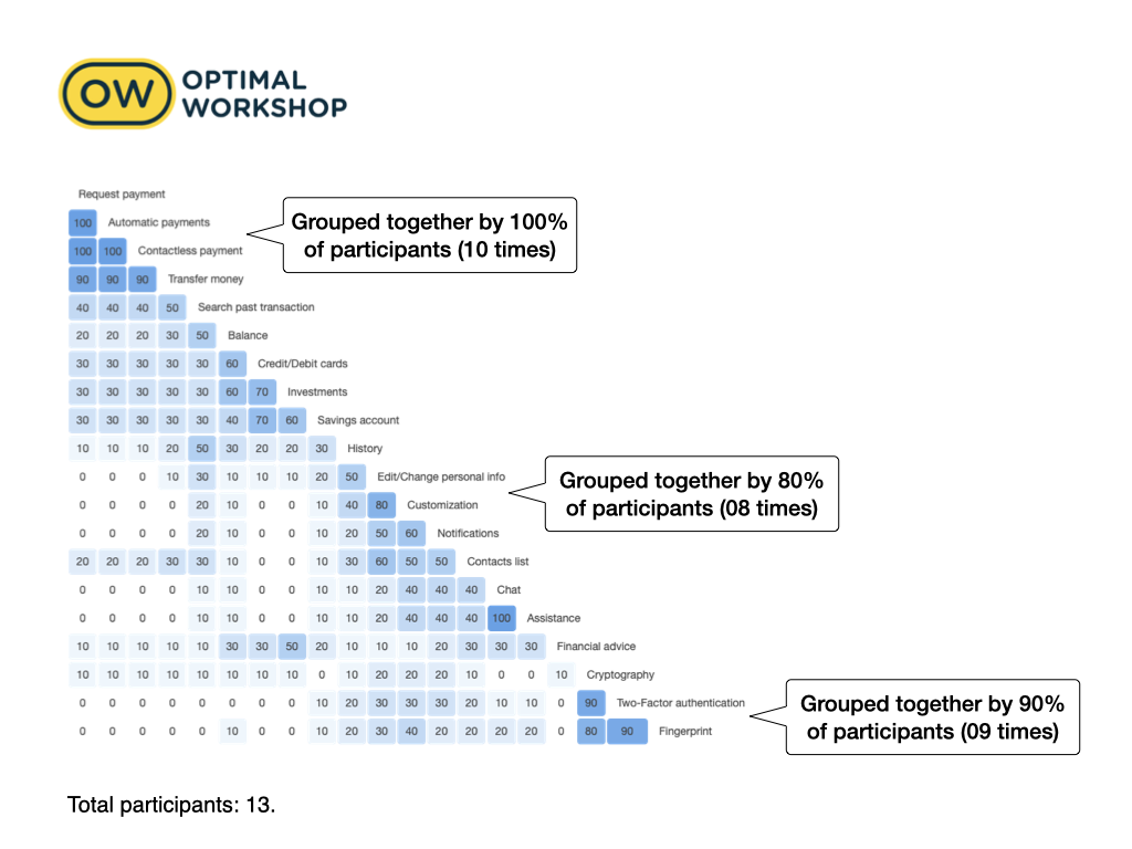
Card Sorting
Aiming to improve the site map and adjust the placement of features to the user's needs, I asked 11 participants to sort 20 cards into groups, utilizing Optimal Workshop.

Usability testing
To evaluate the prototype, I conducted Usability Tests (plan, script, and analysis) with 5 participants to observe and measure their interaction with the app, analysing behaviour, feelings, and actions when performing the given tasks.
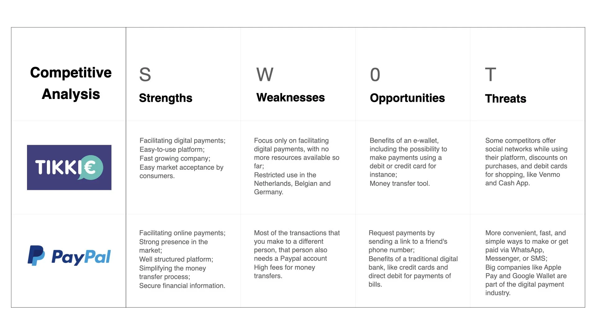
Competitive Analysis

Users interviews - Affinity mapping

User Personas

User Journeys
Card Sorting - Site Map

Sitemap

Usability Test
RESEARCH INSIGHTS
USER INTERVIEWS
Based on the affinity map, we generated the following insights by grouping similar notes under similar headings.
With that, we found out that the users are…
INSIGHT 1
…using applications to make payments more than to request payments;
INSIGHT 2
…concerned about privacy, data and security;
INSIGHT 3
…expecting quick transactions with a confirmation message when completed;
CARD SORTING
From Card Sorting, I discovered that the users…
INSIGHT 4
…understand more effectively the term "payment" rather than transactions;
INSIGHT 5
…assume that "account" and "transactions" belong to the same group, which they called “services";
INSIGHT 6
…acknowledge three categories: settings, security, and services;
USABILITY TEST
The Usability Testing results show that the users …
INSIGHT 7
…expect clear guidance from the app when performing a transaction;
INSIGHT 8
…find the link to be sent to share payments with friends an advantage;
INSIGHT 9
…need to see familiar or intuitive feature names to be able to recognize functionalities in the app;
DESIGN PROCESS
Design best practices
Building the Wise Wallet app was a continuous journey of refining the placement of elements on each screen. I learned that the thoughtful use of white space, grids, alignment, and color not only polishes the interface but also creates a user-friendly experience that’s easy to read, understand, and navigate.
My design decisions were guided by established Design and Navigation Patterns as well as Visual Design Principles, aiming for a clean, aesthetically pleasing interface.
Throughout the process, I gathered valuable feedback from expert evaluations by my mentor and tutor, alongside usability testing with friends, which helped me fine-tune the design to ensure it met user needs effectively.
Accessibility guidelines
Wise Wallet is designed with accessibility in mind, ensuring a more inclusive interface that is easy to navigate for users with varying disabilities.
To meet the Web Content Accessibility Guidelines (WCAG), I made several enhancements, including adding placeholders to form fields and labeling the icons in the bottom navigation bar. Additionally, I chose clear, recognizable symbols and icons throughout the interface to aid user comprehension.
The most significant improvement was in the color contrast, which now meets an AAA accessibility level with a contrast ratio of 16.61:1, fully aligning with accessibility best practices.
Data-driven Design
During usability testing, users struggled with the image carousel, particularly with the arrow being too small and confusion around navigating to the next screen—some users attempted to drag the carousel instead of clicking the arrow.
To address this problem, I conducted a Preference Test to simplify the onboarding flow. I recruited 12 participants and presented them with two different screen transition options.

The results showed that 9 out of 12 participants preferred the screens with a clear “Continue” button and “Dismiss” option placed directly below, as it provided more guidance on the next steps.
Learnings: I learned the key differences between A/B testing and preference testing—an important distinction I initially overlooked.
In the Wise Wallet project, I aimed to compare two onboarding flows to see which one users found more intuitive based on their interactions. Although I referred to it as a “preference test” in my case study, it was actually an A/B test, as I was evaluating performance based on user behavior.
This experience taught me the importance of choosing the right terminology and method to accurately reflect the type of insight I'm seeking.


Usability Heuristics
The "Request Money" flow provided an excellent opportunity to design an interface that incorporates Jakob Nielsen’s principles for interaction design and usability.
The redesigned flow enhances efficiency and learnability, while also offering clear visibility of system status and providing user control and freedom, ultimately reducing cognitive load for a smoother user experience.

FINAL PRODUCT
Making a payment
With Wise-wallet it is possible to pay one or more people simultaneously, choosing from contacts saved on a mobile phone or creating new ones.
The payment can be made from a bank account of the user's choice, registered, and connected with the application.
Payments can be repeated using the scheduling payment option.
Multi-factor authentication ensures that transactions are made only by an authorized user
Requesting payment
Payment can be requested from device to device by simply sharing a link to perform the payment
It is easy to share bills using the calculator feature, which can split the amount equally
Wise-wallet keeps the user informed of the status of the payment and sends proof of successfully made transactions
Debit or credit cards linked to Wise-wallet account
Wise-wallet makes it possible to shop online and perform money transactions from one single platform by unifying banking details, debit, and credit cards, allowing the user to track and get proof of transactions
#656565

Interactive prototype link in Adobe XD
https://xd.adobe.com/view/479d8606-6ad2-4c6e-8962-73f002baa5bd-12ce/
STYLE GUIDE
Icons

Services icons size:

Navigation bar icons size:
Colors
Primary colors:
#031163
Secondary colors:
#1978A5
#F6F7F8

